Visiblio / Brand guidelines
Brand guidelines
How the Visiblio name, logo, colours and fonts are used, and every logo file to download as SVG (for print and the web) and PNG (for slides and documents).
Brand philosophy
Visiblio exists so that anyone responsible for a website can see how visible it is, in Google and in the answers of AI assistants, and know what to do next. It reads the data a team already has and says plainly which page to build, fix or merge.
- Honest numbersOnly real data is shown. Where a number cannot be known, we say so instead of guessing.
- Plain wordsEvery result ends in a short list of things to do, written without jargon.
- Relevance firstA suggestion that belongs on another page is never mixed into this one.
- Free for the teamBuilt to work on free allowances, so a whole team can use it every day.
Brand identity
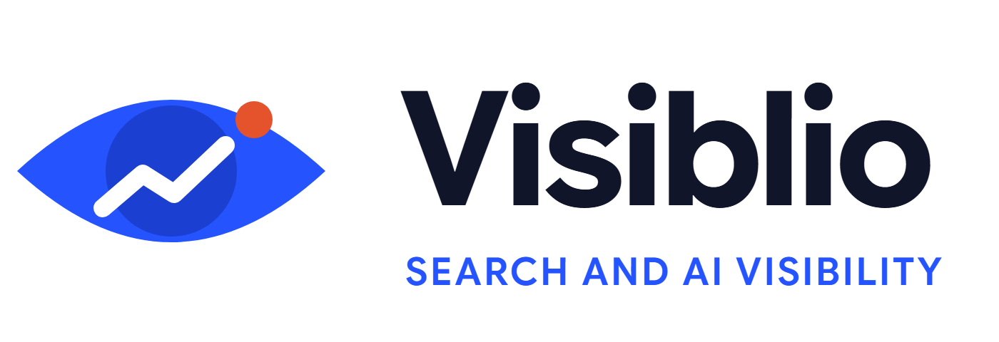
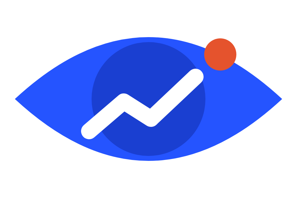
The logo is an eye. The eye stands for visibility: seeing your site the way search engines and AI assistants see it. The white line rising inside it is the trend you are working to improve. The coral spark is the insight that tells you where to act.

- Eye: cobalt, the colour of the product.
- Iris: a deeper cobalt that gives the eye its focus.
- Rising line: always white, always rising to the right.
- Spark: coral, used once, at the end of the line.
Logo variations
Primary logo
Use this one whenever there is room: eye, name and descriptor side by side.


Secondary logo
The stacked version, for square or narrow spaces such as profile pictures, covers and posters.


The eye on its own
Only where the name already appears next to it, or at very small sizes.


App icons
The eye on a rounded square, 512 by 512 pixels. The browser tab icon switches between the cobalt and the dark tile with the device's light or dark setting.


Day and night
The same logo adapts: in night mode the eye lightens so it keeps its contrast, and the name turns white. Use the full colour logo on light pages and the dark one on dark pages.
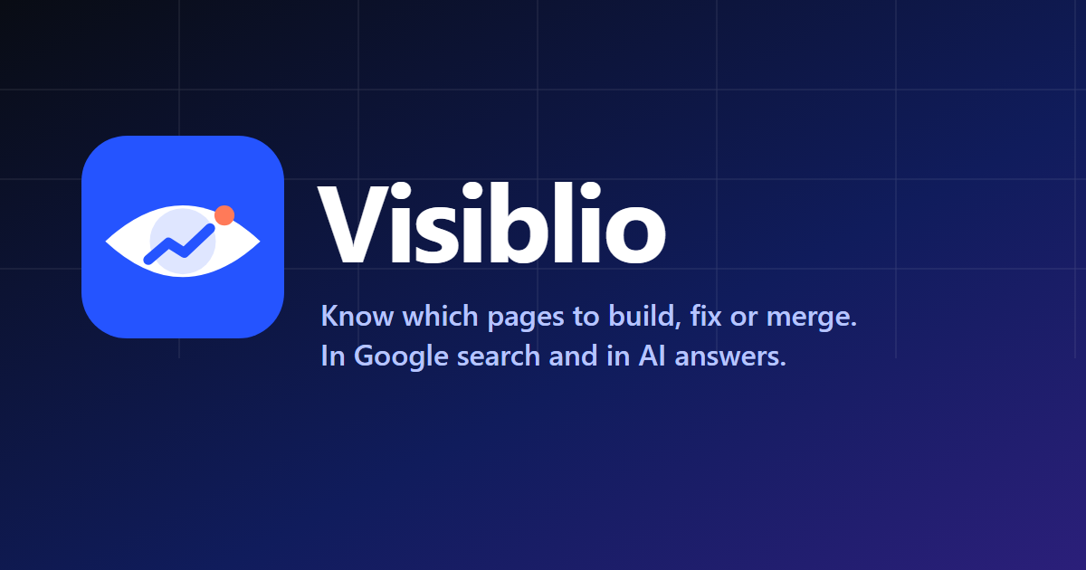
Pictures for sharing



Logo usage
Clear space: keep a margin around the logo equal to the height of the eye's iris on every side. Smallest size: the full logo 120 pixels wide (30 mm in print), the eye alone 16 pixels.
Correct usage
Incorrect usage
Colours
Select a colour code to copy it.
- Cobalt
#2554ffMain brand colour: the eye, buttons, links - Deep cobalt
#1a3fd1The iris, hover states - Ink
#10152aText and the name on light pages - Spark
#e5532dThe spark. Once per screen, never for warnings - Cyan
#0891b2Second chart colour - Violet
#6b4df0Third chart colour, hero glow - Mist
#f6f7fbLight page background - Night
#090c14Dark page background - Night cobalt
#4f7bffThe eye on dark backgrounds - Night spark
#ff7a52The spark on dark backgrounds
Brand fonts
The name, logo and headings are set in Google Sans Flex, a free font under the SIL Open Font License, available from Google Fonts. Text, tables and small labels are set in Inter, a free font by Rasmus Andersson from rsms.me/inter, because its numbers line up cleanly in columns.
Visiblio
Search visibility, in one place
Aa Bb Cc Dd Ee Ff Gg Hh Ii Jj Kk Ll Mm 0123456789
Name and headings: Google Sans Flex Bold. Body text, tables and labels: Inter Regular and Semibold.
How we write
- Say what to doLead with the action: build this page, fix this link.
- Say it plainlyShort sentences, no jargon, explain a term the first time.
- Never invent a numberIf it is an estimate, call it one.
The name is always written Visiblio, with a capital V and no other capitals.